


Sneha Godbole
Product Designer and Business Analyst
LOADING QUEST LOGLVL 1 / 3
Sneha Godbole · Product Designer, Client to Launch
Sneha Godbole
PRODUCT DESIGN · BUSINESS ANALYSIS · DELIVERY

Good products
start with good
conversations.

I’m a product designer and business analyst. I work between clients, business teams and developers so that what gets built is what was actually needed, from the first brief to the final release.

As a business analyst, I help define the problem and what success looks like. As a designer, I work out the solution. Then I stay involved through development and release.

2 YEARSDESIGN + BUSINESS ANALYSISSTARTUPS & SMALL BUSINESSES6+ PRODUCTS
A-1

Selected work

A-2

How I work

{{ s.no }} {{ s.label }} {{ s.desc }}
A-3

About

I’m a product designer based in India with two years of experience, mostly with startups and small businesses. Most of my projects started with no design precedent and several people wanting different things, so I get involved early. I talk to stakeholders directly, map out the whole system before drawing any screens, and stay close to development until the product ships.

I studied accessory design at NIFT and started my career in retail and visual merchandising, drafting fixture and display drawings for stores. A contractor builds exactly what the drawing says, so every note had to be unambiguous. I still hand off designs the way I’d hand off a drawing: complete enough to build from.

I enjoy products with a lot of moving parts: many users, many stakeholders and rules that need working out. I care about how a product works as much as how it feels, and I like owning a problem from scope to release. Outside work I explore restaurants on my own, hike, read and play games.

YOUR PROGRESS{{ lvlText }}
{{ achCount }}/{{ achTotal }} {{ toggleLabel }}▾
CASE STUDIES · {{ csDone }}/{{ csTotal }}SAVED ON THIS DEVICE
{{ r.code }} {{ r.name }}
{{ r.label }}
COMPLETE ✓ VIEW PROJECT →
ACHIEVEMENTS · {{ achCount }}/{{ achTotal }}
LOCKED {{ a.type }}
{{ a.title }}
{{ a.desc }}
KEEP EXPLORING
{{ keepTitle }}
{{ keepHint }}
A-4 · CONTACT

Got a hard system?
Let's draw it out.

DRAWN BY SNEHA GODBOLEINDIAREV 2026.10SHEET 01 / 03
Sneha Godbole
Trade Fair ERP · {{ seenCount }}/8LVL {{ lvl }} / 3{{ lvlLabel }}
XP {{ xp }} ✦ {{ achCount }} / {{ achTotal }}
P-01
25 shows a year. 20 roles. No way to see across any of it.

Trade Fair ERP

Redesign of a trade fair management platform, covering 20+ internal roles and a public-facing exhibitor and visitor website. Done as the sole designer.

TOOLS USEDFigma + Figma MakeFigJamMiroClaudeWordExcel
ROLE
Sole UX/UI Designer and Business Analyst
DURATION
1.5+ years
TEAM
CPO, CTO, Head of Tech, PM, Dev team and QA
PLATFORM
Internal web app and external websites
STATUS
Finance and Projects live, remaining in production
20+user roles
~200screens
25shows per year
100–150internal users
UnderNDAscreens not shown
D-1

Context & problem

This project was for an Indian subsidiary of a leading European trade fair organiser, which runs 25 shows a year across agriculture, technology and consumer products. Each show has its own exhibitors, visitors, finance approvals, vendor logistics and legal sign-offs, managed by a team of 100 to 150 people. Despite that scale, the platform had never really been designed. It had grown piece by piece. To do anything, you had to navigate into a specific event, find the right screen, and start from there. Several workflows, including visitor registration and vendor onboarding, had no digital version at all.

There was no comparable system to reference in the Indian trade fair market. I was the only designer, responsible for every role, every flow and every screen across both the internal application and the public-facing websites. The hard part was understanding a system where how Finance handled an event directly shaped what Operations could or could not do next, and a change in one role could break the workflow of another. The question I kept coming back to was: how might we give a team managing 25 shows a year a way to work across all of them at once, instead of treating each event as a separate island?

NOTE
Early on I saw that the system was organised around events, but the people using it needed to work across events. That one insight shaped almost every major decision that followed.
D-2

Users & conflicts

{{ u.name }}
NEEDS
{{ u.needs }}
CONFLICTS WITH
{{ u.conflict }}
D-3

Process

NONAMENOTE
{{ a.no }}{{ a.name }}{{ a.note }}
RESEARCH CONSTRAINT

Leadership was hesitant to brief teams on the incoming changes early on, out of concern about resistance to adoption. This limited how much direct user input I could get in some roles before designs were finalised.

D-4

System map & flows

finance · projects · operations · management
Event creation approval chain across departmentsBlurred for confidentiality
Event creation approval chain across departments
Current and new flows for each roleBlurred for confidentiality
Moving from event-by-event to a global flow for each role
Before/after: the SAP event creation flow
{{ s.no }} {{ s.who }} {{ s.what }}
{{ sapCount }} {{ sapSummary }}
D-5

Key decisions

{{ d.no }}{{ d.title }}
CONSIDERED
{{ d.considered }}
CHOSEN · WHY
{{ d.chosen }}
D-6

Handoff

Figma · roles, components and styles
Annotated Figma spec, redactedBlurred for client confidentiality
Documentation format, redacted

I worked with the dev team daily throughout the build rather than handing off designs all at once. Every screen was annotated with states, edge cases, permission conditions and responsive behaviour. For more complex flows like the approval chain and the admin permission system, I wrote separate logic documents alongside the Figma files, since the screens alone could not capture everything that needed to happen on the backend.

CAUGHT IN DEVELOPMENT

The admin permission system works across four levels, role, event, page and action within a page. At some point during development it became clear the team had interpreted the hierarchy differently from how it was designed. They were applying event scope before role scope, which would have broken the entire model. Catching it during a review call saved the backend team a large rework.

D-7

Outcomes

EFFICIENCY
Event creation without developer tickets
The Project team now updates event details directly on the platform. A task that used to require a ticket, a wait, and multiple back-and-forth messages to confirm the SAP code is now done by one person in a single session.
EFFICIENCY
Finance reports without event-by-event navigation
The Finance team can access daily reports, filter transaction tables, and export data directly from the platform without navigating into individual events.
LIVE
Exhibitor storefront running alongside the existing website
The new order process launched as a structured storefront, replacing a set of disconnected forms for booths, electricity and services. It went live as the first phase of the full external redesign.
IN PROGRESS
Remaining roles still in development
The Operations, Sales, Admin and Senior Management dashboards and the full exhibitor and visitor journey were still in development. Widget-based live dashboards were planned as a final phase.
D-8

Takeaways

What I enjoyed most about this project was working on a complex system with a large number of stakeholders. I also got to go to real trade fairs and see what the internal teams go through while an event is running. Seeing it first-hand changed how I thought about the design, because some of that pressure never comes up in a meeting.

Access to users was limited early on, so I relied on system audits and conversations across roles to fill the gaps. It worked, but it added iteration cycles. I did ask for direct access, but I could have made the need clearer from the start. On a future project I’d make that case early, with a clear view of what direct access would save the team.

Want the full walkthrough?

I’m happy to take you through the approval chain, the permission model and the decisions on a call.

Next · P-02
Gama Gamaa
→
PROJECT
P-01 Event Platform
DRAWN BY
Sneha Godbole
REV
2026.10
SHEET
02 / 03
Sneha Godbole
Gama Gamaa · {{ seenCount2 }}/8LVL {{ lvl2 }} / 3{{ lvlLabel2 }}
XP {{ xp }} ✦ {{ achCount }} / {{ achTotal }}
P-02
300 users. 2 outlets. One WhatsApp broadcast a day.

Gama Gamaa

A home-style meal delivery business in Chennai ran its orders, wallets and menus over WhatsApp. I designed the app, website and admin portals that replaced it, from the ground up.

TOOLS USEDFigmaMiroJiraWordExcel
ROLE
Sole UX/UI Designer and early PM
DURATION
6+ months, ~2 in design
TEAM
Client and a two-person dev team
PLATFORMS
Consumer mobile app, admin and store manager portals, marketing website
STATUS
All platforms live
3platforms
1500+users, up from 300
4outlets, up from 2
6+months
LIVEevery surface shipped
Gama Gamaa admin portal and mobile app screens
D-1

Context & problem

Gama Gamaa delivers home-style Indian meals to working adults in Chennai, the kind of food people miss when they're too busy to cook. The food was popular and orders kept coming in, but the whole operation ran over WhatsApp. Users got a daily broadcast of the lunch and dinner menu and replied with their order, takeaway or delivery. To top up their wallet they messaged an amount, waited for a UPI link and paid. The back-office team tracked every order and balance by hand.

At 300 users and 2 outlets this was manageable, but fragile. The daily broadcasts felt like spam, so users muted them and missed orders they actually wanted. Nobody could see what they'd ordered or what their balance was without asking. The back office was tracking everything by hand, and that workload was growing faster than the business. That setup limited how fast the business could grow.

illustrative reconstruction of the whatsapp ordering flow
Gama Gamaa
Illustrative reconstruction
Good morning! Today’s lunch: Mor Kuzhambu, Keerai Masiyal, Idiyappam, Veg Kurma. Reply by 10:30 to order.
2 Mor Kuzhambu and 1 Idiyappam please, delivery
What’s my balance? I want to top up 1000
Please pay here: upi://pay?… We’ll update your wallet once received.
Did my order from yesterday go through?
Illustrative reconstruction of the WhatsApp ordering flow
D-2

User personas

U-01 · PRIMARY PERSONA01 / 04
Working adults
25–40
Chennai · Orders for self and family
Moderate tech literacyTime-pressedFamily orders
ABOUT
Working adults ordering home-style meals for themselves and their families. Comfortable with apps, but not power users.
NEEDS
  • Know what’s available right now, without scrolling through a chat
  • See wallet balance and order history without asking anyone
  • Place an order in as few steps as possible
  • Trust that the order went through
PAIN POINTS
  • Daily broadcasts felt like spam
  • Muted notifications and missed ordering windows
  • No order history or tracking
  • Opaque wallet balance
DESIGNED FOR
Today’s menu and the order action are the first things on screen.
PLATFORM
Mobile appWebsiteAdmin portalStore manager portal
U-02 · SECONDARY PERSONA02 / 04
Older users
60–70+
Order for themselves and the household
Less confident with appsFirst digital orderNeeds clarity
ABOUT
Users up to 60–70+ placing orders for themselves and their households. Some were opening a food ordering app for the first time.
NEEDS
  • An interface that doesn’t assume users know ordering apps
  • Plain-language labels over shorthand
  • Clear confirmation at every step
  • Confirmation that the order went through
PAIN POINTS
  • Unfamiliar with ordering apps
  • Time-gated slots are easy to misread
  • Unsure whether an order was placed
DESIGNED FOR
Plain-language labels and clear confirmation at every step, with generous tap targets.
PLATFORM
Mobile appWebsiteAdmin portalStore manager portal
U-03 · OPERATIONS PERSONA03 / 04
Main admin
Back-office team · All outlets
Not technicalHigh-stakes daily workMulti-outlet
ABOUT
The back-office team managing menus, orders, users and outlets, working under time pressure before each ordering window.
NEEDS
  • A view across every outlet, order, user and menu
  • Publish daily menus before a slot opens
  • Manage wallets, subscriptions and staff access
  • Run the KOT system
PAIN POINTS
  • Manual menu management across outlets
  • Wallet top-ups handled by hand
  • Kitchen orders on paper
DESIGNED FOR
The back office runs the whole business from here, so the screens carry a lot but stay easy to move through.
PLATFORM
Mobile appWebsiteAdmin portalStore manager portal
U-04 · OPERATIONS PERSONA04 / 04
Store manager
One outlet · One day
Single outletKitchen-facingShift-based
ABOUT
Runs one outlet through the day and needs to see what to cook and dispatch, with nothing extra.
NEEDS
  • Today’s orders, filtered by slot
  • Kitchen slips ready to print
  • A CSV export
  • Item counts at a glance
PAIN POINTS
  • Orders handled on paper
  • Slow, error-prone kitchen slips
DESIGNED FOR
Only what the shift needs is on screen.
PLATFORM
Mobile appWebsiteAdmin portalStore manager portal
D-3

Research & process

I was the only designer, and ran the project until a dedicated PM joined. Every surface, from the consumer app to the store manager portal, was mine from first flow to handoff, working directly with the client and a two-person dev team.

DESIGN PROCESS
01DiscoverClient conversations and the BRD. I mapped the WhatsApp flow end to end to find every friction point.
02DefineIA and user flows for all three platforms: ordering, wallet top-up, order history, menu management, KOT and outlets.
03DesignWireframes to high fidelity in Figma, with formal client reviews and informal feedback in between. One shared component library.
04DeliverI worked alongside the devs through the build: answering questions, reviewing what they built and adjusting designs around technical limits.
NONAMENOTE
{{ a.no }}{{ a.name }}{{ a.note }}
RESEARCH CONSTRAINT

I didn't speak with end users in a structured way. The design came from a clear brief and a well-informed client, and wasn't tested with users before development.

D-4

Final flows

Before/after: placing an order
{{ s.no }} {{ s.who }} {{ s.what }}
{{ waCount }} {{ waSummary }}
S-01

Mobile app

mobile app · scroll each flow sideways
Gama Gamaa mobile app flow: onboardingGama Gamaa mobile app flow: menuGama Gamaa mobile app flow: checkoutGama Gamaa mobile app flow: walletGama Gamaa mobile app flow: account
S-02

Marketing site

marketing website · scroll inside the frame
gamagamaa.in
Gama Gamaa marketing website, desktop
gamagamaa.in
Gama Gamaa marketing website, mobile
S-03

Admin app

admin portal · a selection of screens
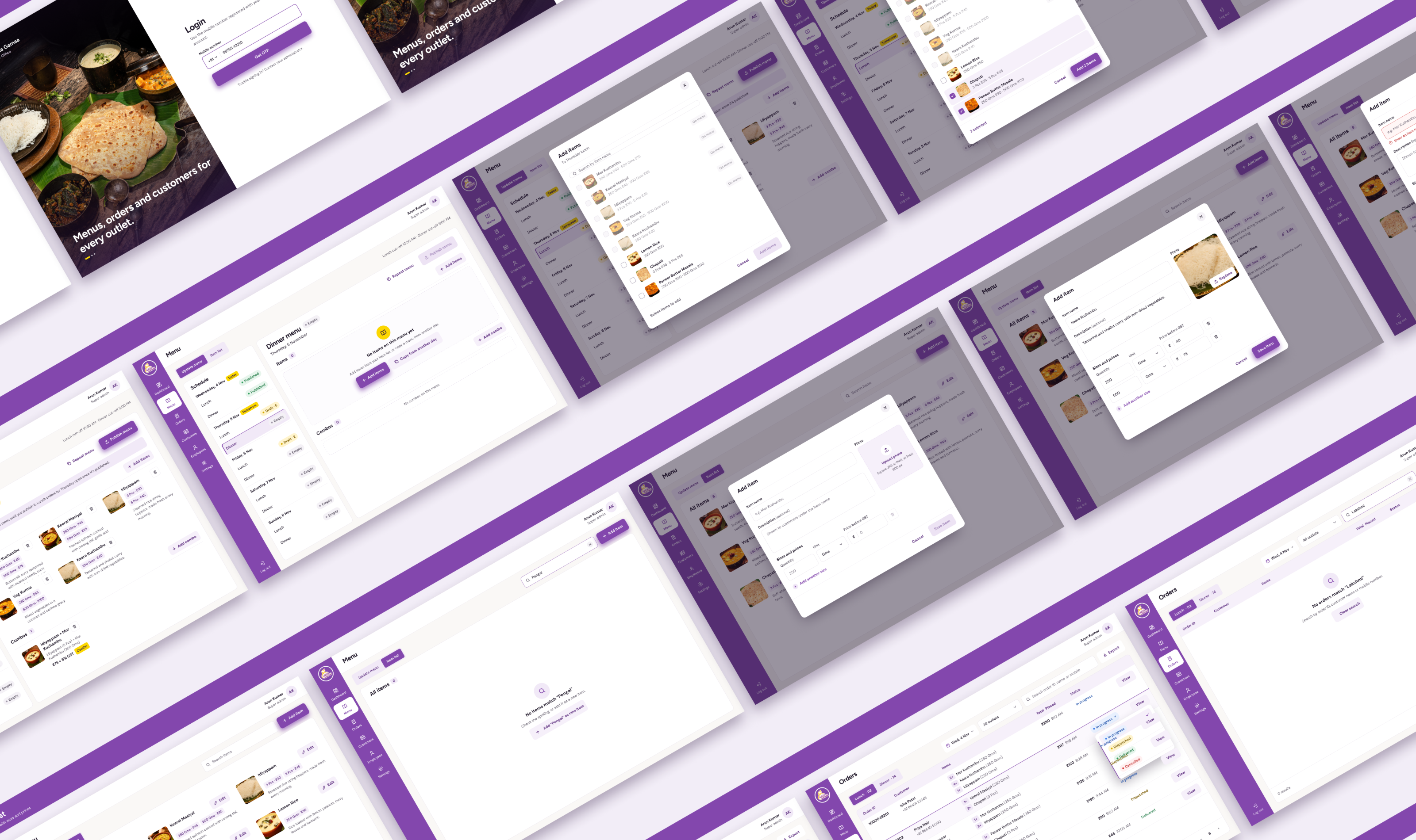
Admin portal screens: login, menu builder, item list and orders
A selection of admin portal screens across login, menu builder, item list and orders. Not every screen is shown.
KEY ACTIONS
MAIN ADMIN
  • Set and publish menus by slot, including combos
  • Track orders and print kitchen slips across outlets
  • Manage users, wallets and top-ups
  • Add outlets and assign staff
STORE MANAGER
  • See today’s orders for one outlet
  • Filter by slot
  • Print kitchen slips
  • Download a summary CSV
D-5

Key decisions

{{ d.no }}{{ d.title }}
ON WHATSAPP
{{ d.before }}
CHOSEN · WHY
{{ d.chosen }}
D-6

Design system

A shared component library in Figma across all three platforms: brand purple as primary, warm neutrals and semantic status colours, a type hierarchy for mixed age groups, and components built once and reused across mobile and web with responsive variants.

colour palette and typefaces
Gama Gamaa typography and colour palette
Colour palette and typefaces
component library
Gama Gamaa component library
Component library
D-7

Outcomes

SCALE
Users grew from ~300 to 1,500+
Along with user growth, the number of outlets went from 2 to 4 after launch.
ORDERING
Orders moved from WhatsApp to the app and website
Users see the current menu, order history and each slot's status without asking anyone.
KITCHEN
Digital KOT in place of paper
Store managers view, filter and print kitchen slips straight from the order screen.
LIVE
All three platforms live
The app, admin portal and website all shipped.
D-8

Takeaways

This project taught me how an app actually gets built. I designed the app, the admin portal and the website, worked with developers for the first time and saw real users use what I’d designed. After launch, I received feedback from both the client and the people using it.

Before launch, I got user feedback through the client, who knew their customers well, and because it was easy to get, I didn’t push for direct contact with users. With users up to 70, I’d now ask for a few conversations myself, especially with older users, to check assumptions I couldn’t verify.

All screens shown are from the live product. Some features were added or modified after my engagement ended.

Want the full walkthrough?

I'm happy to take you through the slot logic, the admin portals and the decisions on a call.

More coming soon
Return to home
→
PROJECT
P-02 Food Ordering
DRAWN BY
Sneha Godbole
REV
2026.10
SHEET
03 / 03
✦
ACHIEVEMENT UNLOCKED · {{ achCount }}/{{ achTotal }}
{{ toastTitle }}
{{ toastDesc }}